Coach Tom - Health & Wellness Consultant
The Brief
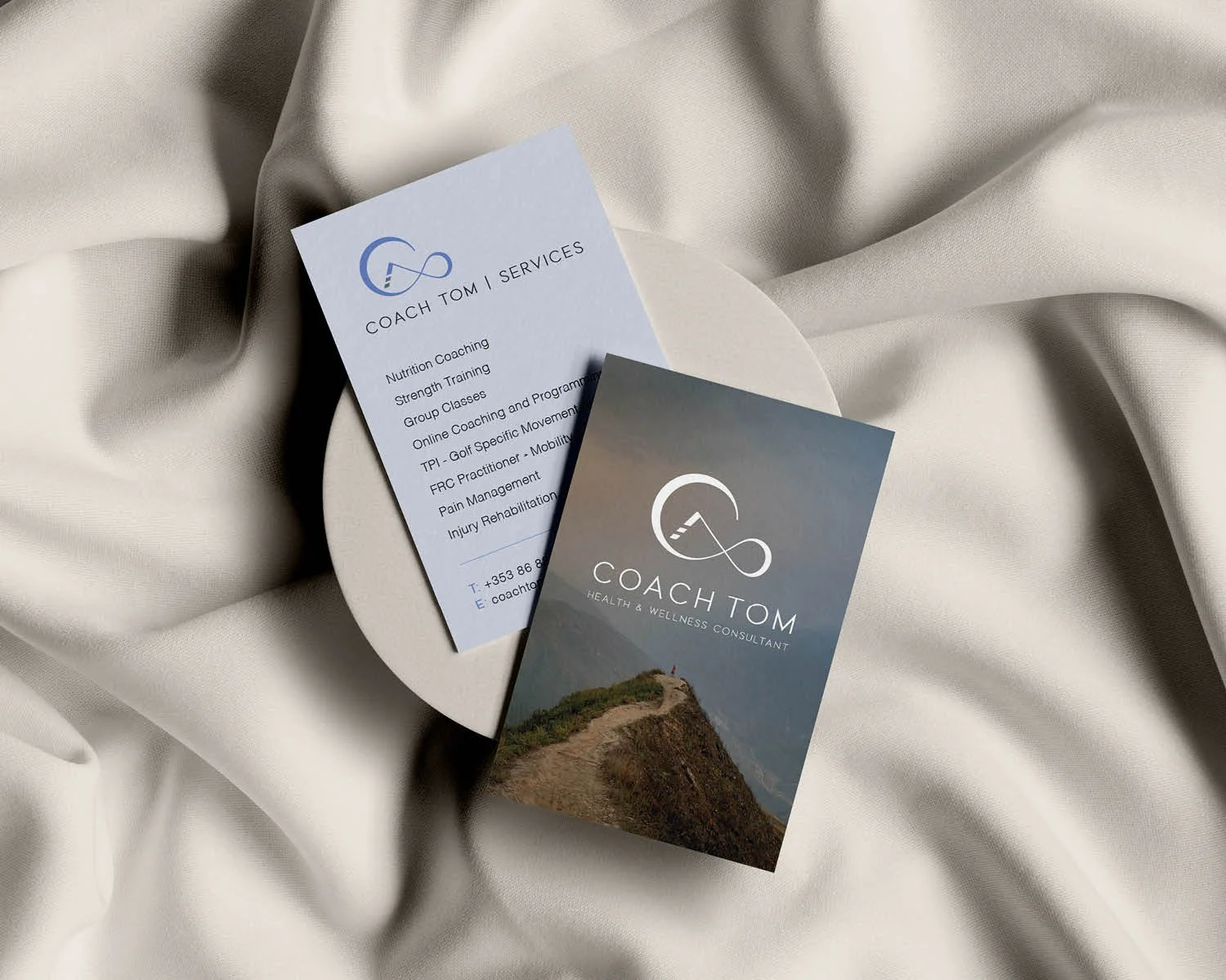
A rebrand for a health & wellness coach to reflect how his business and offering has grown. His services include - Nutrition Coaching, Strength Training, Group Classes, Online Coaching and Programming, TPI - Golf Specific Movement Assessment, FRC Practitioner - Mobility Specialist, Pain Management and Injury Rehabilitation / Prehabilitation.
“As I have evolved in this industry, I felt my branding needed to match that. The brand represents my continuous love of learning new movements and skills. Then exploring what I have learned and finally passing that knowledge on, by teaching others. There's nothing more pleasurable than helping someone move better, live without pain, feel mentally and physically stronger and reach goals they never thought possible.”
— Coach Tom
The Brand Story
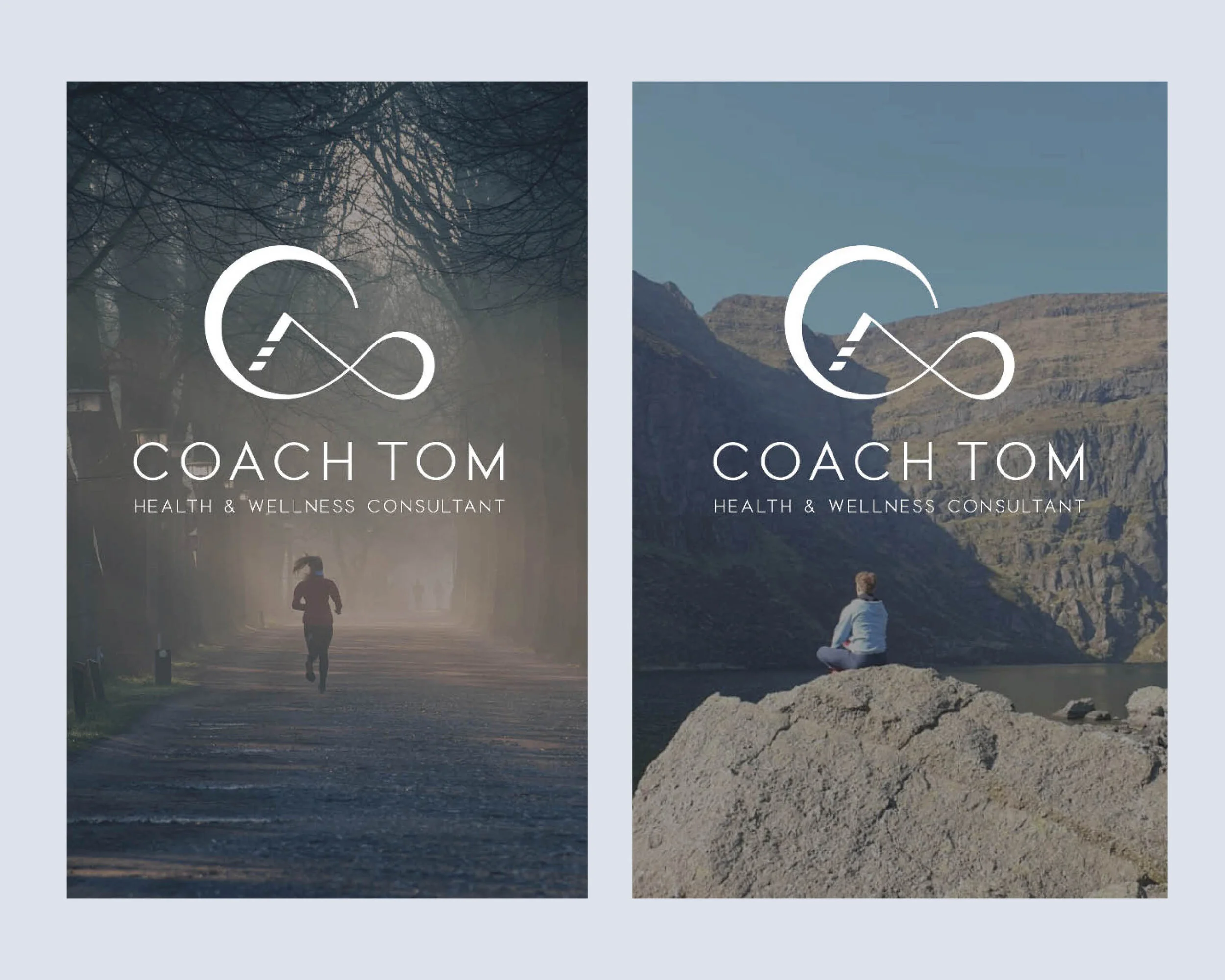
The logo is a combination of an infinity symbol and a triangle, designed with the brand photography in mind. The gaps in the triangle represent the steps Coach Tom’s clients take to reach their goals.
Triangle symbol: Balance and harmony and completion. Body, mind and health. (The Wellness Triangle is a measure of the three main categories that contribute to overall health and well-being. The three equal sides of the triangle represent the three equal components that affect health: structural/physical, nutritional/chemical and emotional/mental.)
Infinity symbol: The infinity symbol represents the human capacity for infinite development. Flowforms, movement. Timelessness, personal empowerment, joy and knowledge.


